New Website
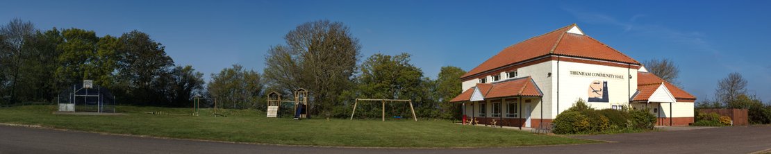
Launch of a new website for the hall
Following the election of a new committee for the hall it was decided to update the existing website using newer technologies which better handle the range of modern devices and capabilities. There have been quite large changes in expectations for what web sites offer in recent years.
Since many people will likely access the web site on a mobile device it was necessary to employ what is known as a responsive or mobile first design. This philosophy attempts to generate a page which will dynamically resize and position elements as much as possible to suit the size and type of display in use.
In effect when a phone or tablet is switched from portrait to landscape view (or a browser window is resized) the page will adjust to suit. Where multiple columns are in use on larger displays (i.e. 4k monitors on a PC/Mac) these will fall back to single columns on smaller devices or browser windows.
There will be a few pages where it is difficult to fully adapt to small screens, calendars are a good example. We will however follow the responsive pattern as much as possible.
Many modern browsers now support the ability to conform to the user's local preference for light or dark mode. This website will respect light/dark mode selection, if the browser in use is capable of doing so.
Support of dark mode by browsers is a recent best practice for web designers. It is unfortunate that many web sites do not yet support this. Where a user has selected dark mode to reduce eye strain it can be quite jarring to suddenly be confronted with a website that insists on ignoring user preference and having a white background with dark text!
The new web site is also SSL/TLS enabled so that it will show the padlock icon in the search bar on a users browser. Users can thus be assured that any data exchanged with the site is secured.
The above combined with the use of Wagtail CMS for the new design should allow for a better browser experience going forward.